Friday, April 27, 2012

Graduate Portfolio

Due to the length of my portfolio, I have chosen to show only the title pages of each project.  Please click on the following link to view my full portfolio:  Lauren Brown's Graduate Portfolio


Friday, March 2, 2012

Monday, February 13, 2012

Exploration of a Project Site


I chose to explore the project site for my graduate creative project. The image above is a graphic representation of the surrounding land use. The surrounding area transitions from commercial zoning to residential housing to a natural park setting. There is also an arterial road (Binford
Blvd) that dissects the area.

A combination of Adobe Photoshop, Adobe Illustrator, and AutoCad was used to create the above image. Photoshop allowed me to create the three sections. Entourage was found through the use of Google Images and files from my image library. These elements were then cropped and combined in Photoshop. Different opacities were used to create a sense of depth. The
leader lines and labeling of the sections were done in Illustrator.


A map of Indiana was found through Google Images. In Photoshop, the background colors and labels were deleted, leaving just the outline of the state and counties. The Paint Bucket tool was used to fill in the background with a solid color. This file was then placed into Illustrator. The
opacity was lightened so that it fades into the background.


The map of Indianapolis' highway system was found on Google Images. The background and other elements from clipped out by using the Polygonal Lasso tool in Photoshop. This file was then laid over top of the Indiana map. The opacity was then lightened.


An aerial map was pulled from Google maps and imported into AutoCad. The streets and water zones were then traced to create the line work. This file was then exported into Illustrator. The line weights were adjusted to create a hierarchy for the streets. The Blob Brush tool was used to paint the project site. Text was added.

This type of analysis helped me understand the character of the area surrounding the project site. While designing, this understanding will assist me in my choices of shape, form, and materials.


Monday, January 30, 2012

Concept to conception of the Olympic Sculpture Park


As a firm, Weiss/Manfredi aim to create designs that illuminate the physical and cultural uniqueness of each site. By trying to broaden the definition of design, they see every site as an opportunity to shape the contemporary culture. They employ movement, light, and materiality to intensify awareness and experience (firm’s website). Most of their work highlights the key connection between nature and order. In addition, they consider creative approaches to ecological needs (Weiss and Manfredi, Site Specific 13). They understand the importance of researching all the different pre-existing conditions of a location and then use this information to energize the design (Weiss and Manfredi, Surface/Subsurface).

Their most famous piece of work is the award-winning Olympic Sculpture Park in Seattle, WA. Established in the mid-ninteenth century, Seattle is considered a young city. It possesses a complicated relationship between topography and multiple contacts with bodies of water. Seattle’s urban grid is representational of the original farmland and wasteland (Busquets 17).
The construction of streets developed the original geometrical order, which was later emphasized by the addition of permanent buildings (Busquets 17).

“Specialized transport infrastructure (railway and long-distance road links) created an independent system of relations between the parts and functions of the city at the overall scale” (Busquets 18). Seattle has undertaken a urbanization process to enhance the development along the water’s edge. This effort is to accommodate the movement of people between the city and the water and the handling of goods at the many ports (Busquets 19).


The Olympic Sculpture park is valuedfor the way it respects the interactions between the urban fabric, the infrastructure, and the water’s edge (Busquets 17). “The design not only brings sculpture outside of the museum walls but brings the park itself into the landscape of the city” (firm’s website). The chosen site was an 8.5-acre industrial brownfield that had been previously used as an oil transfer facility. It was split by active railroad tracks and an arterial road (Huber 6). There is a stricking contrast between the stability of the urban patchwork and the instability of the water’s edge (Busquets 21). Their solution was a Z-shaped continuous landscape thatwanders from the city to the bay capturing the energy of the city and creating linkage whereseparations existed (Pearson 112, Huber 6). Manfredi said, “Their work has a therapeutic value for the social and cultural health of the city” (Huber 7). They wanted to create an evironment which illuminated the combination of art, the city, and the water (Weiss and Manfredi, Surface/Subsurface). The
sculpture park successfully questions where the park begins and where the art ends.

This sculpture park allows the visitors to feel completely engulfed by their surroundings. Weiss/Manfredi left the site very open and exposed. Layering over the existing infrastructure, they have provided a new pedestrian walkway that provides interaction with artwork, as well as, views of the Olympic Mountains, the Puget Sound, and the skyline of the city complete with the Space Needle. (“Olympic Sculpture Park in Seattle” 39). Weiss/Manfredi created forced perspectives by using an angled indirect path that allows distances and sites to appear longer and larger (Pearson 112). The landscape was designed to present the sculptures. Due to designated locations for sculptures, the museum is able to rotate what is on display, although there are a few permanent pieces.

In order to create new topography to link the east side of the park to shoreline, they incorporated three landscapes native to the Northwest. They began by starting with an Evergreen forest with a ground cover of ferns. Next came a deciduous forest of Quaking Aspens. They ended with a tidal terrace for salmon habitat and saltwater vegetation (“Olympic Sculpture Park in Seattle” 40).

Since Seattle sits on a seismically active area with a rainy climate, Weiss/Manfredi had to find a way to work with these challenges. They engineered a modular system of retaining walls, which stretches the length of the park, to stabilize the site in case of any shifts in the natural forces (Huber 7). Reinforcing existing seawall shelves required the installation of a submerged buttress. This created a new aquatic habitat. The rainwater flows off the angles of the roofs and terrace into a drainage system, which leads the water into Elliott Bay. The use of the drainage pipes allows the water to enter the bay without being contaminated with industrial residue or causing erosion paths (Huber 9). While fusing architecture and landscape together rather seamlessly, they created a landscape that appears to be just as artificial as the architecture, in the end creating a completely invented landform (Weiss and Manfredi, Surface/Subsurface 20).

Weiss/Manfredi are renowned architects whose work considers all aspects of design. They are noted for their creativity in making each site a successful union of architecture and landscape. This is accomplished by incorporating historical qualities, ecological considerations, aesthetics, and service. The success of the Olympic Sculpture Park lies with the thoughtful translation of the powerful interaction between the specialized transport infrastructure, the urban grid, and the water’s edge (Busquets 19).


Multiple means of graphic representation were used in the development of the Olympic Sculpture Park. ArcGIS was used to develop a thorough site inventory and analysis of the project site. Photomerges, produced in Adobe Photoshop, created panorama views of the surrounding skyline. A sense of what the sculpture park would look like was produced by layering hand drawn perspectives over these panorama views. Adobe Photoshop was also utilized to create an aerial view of the site. The proposed design is emphasized in this image by being able to have the city infrastructure in grayscale and the design of the sculpture park in color. With the use of Rhino and Adobe Illustrator, a series of diagrams were produced to depict the different infrastructural layers of the design. An infrastructure concept model was produced by combining a Rhino 3-D model with image clippings from Google Earth. Color and textures were added in Adobe Photoshop.

Sources:

Huber, Nicole. "Olympic Sculpture Park - Seattle WA." Places - A Forum of Environmental Design 2008: 6-11.

Manfredi, Michael A. Weiss/Manfredi: Surface/Subsurface. New York: Princeton Architectural Press, 2008.

Pearson, Clifford. "Olympic Sculpture Park." Architectural Record July 2007: 110-117.

Weiss, Marion. Site Specific: The Work of Weiss/Manfredi Architects. New York: Princeton Architectural Press, 2000.

Weiss/Manfredi. Olympic Sculpture Park for the Seattle Art Museum. Ed. Joan Busquets. Cambridge: Harvard Design School, 2008.

Monday, January 23, 2012

The Art of Landscape Architecture


Here are four examples of contemporary landscape architecture drawings that have inspired and influenced my creative style.


The first image was created by the firm Gross.Max. The photo collage was created with the use of Adobe Photoshop and a 3-D modeling platform such as Rhino. This image depicts the Schuytgraaf ArcheologicalField in a surrealistic manner. The use of transparencies and different opacities creates a light and airy sensation.

Hargreaves Associates created the second image in order to diagram the different layers of their design for the London Olympics in 2012. The line work was created in AutoCad. Then was brought into a 3-D modeling platform to create the topography layer of the diagram. The line work was also brought into Adobe Illustrator to from the other three layer. By bringing these different files into one Adobe Illustrator, they were able to skew all for layer and extrude them upward to create the exploded feel.

The image above is a prototypical american suburb created by Lewis. Tsurumaki. Lewis. The combination of hand graphics and Adobe Illustrator creates a different, more flexible feeling to the axon.With the muted pallet, the focus of the drawing becomes the buildings which is the main aspect of the design.
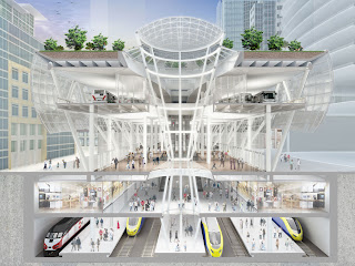

The above section was created by PWP Landscape Architecture for the Transbay Transit Center. Even though this drawing is very detailed, it is able to convey the light and airy qualities of the design. The muted color pallet contributes to this feeling. Adobe Photoshop was used to place vegetation and entourage element on top of a 3-D Rhino drawing.